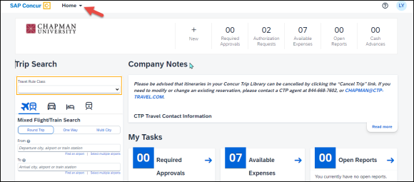
SAP has made cosmetic changes to the Concur platform, resulting in a refreshed, modern appearance. These changes prioritize inclusive and accessible design to provide an improved, consistent, and aligned user experience across all solutions.
Notably, the adoption of the SAP Fiori with Horizon visual theme will not impact any features or functionality of SAP Concur products. Instead, it primarily alters the platform’s aesthetics, encompassing elements like fonts, font sizes, icons, colors, and rounded corners. The navigation menus on both the SAP® Concur® mobile app and web version have been slightly adjusted to enhance user-friendliness.
Specifically, the menu items previously found across the top of the screen are now conveniently situated within the Home dropdown menu, positioned next to the SAP Concur logo in the top left corner of the page.


