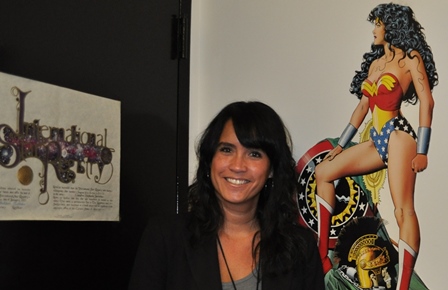
The stories behind those trinkets, artworks and mementos in faculty offices won’t show up on their CVs. But the things faculty collect help us see another side of their academic lives. This month in Office Ours we ask why Associate Professor Claudine Jaenichen keeps a poster of Wonder Woman in her office. Hang on for a heroic tale of what happens when design meets science.
Years ago, she wanted to be Wonder Woman. Save people from chaos and calamity. Rappel down and pluck avalanche victims from certain doom. Fight forest fires. So Claudine Jaenichen, associate professor in the Department of Art, entered a search and rescue training program.
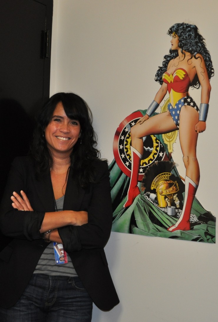
Associate Professor Claudine Jaenichen says she doesn’t have the steely nerves of Wonder Woman, but she still tries to come to the rescue with graphic design that makes important information easy to understand.
But there were a few minor problems.
“It was so difficult. It was so physical. I got migraines. I got carsick,” Jaenichen says.
Then one day, in the roiling cold of the Kern River, there was a big problem. During a swift-water rescue drill Jaenichen entered the river and remembers only that “I met my unconscious personality.” Basically, she forgot everything she’d been taught and froze. When Jaenichen did react, she swam into the current at a lethal 90-degree angle, instead of the life-saving 45-degree approach that had been taught. The exercise spun into an emergency rescue for the team that had to leap in and save her from drowning.
The associate professor and graphic design teacher says behavioral psychologists call that kind of reaction temporary cognitive paralysis. Despite training, Jaenichen would never be Wonder Woman material.
Or so she thought.
Today the life-changing experience shapes Jaenichen’s scholarly work as an information designer who partners with behavioral scientists to create the kind of messaging that will help people not panic in the event of a tsunami. Now her tsunami evacuation maps are helping California coastal cities teach their residents and tourists how to evacuate to safety should such an earthquake-induced tidal surge come ashore. Her easy-read maps now can be found:
-
- In brochures and/or in public signage in the Los Angeles-area communities of Marina del Rey, Venice, Harbor City, Long Beach and Santa Monica, throughout San Diego County and the Orange County cities of Huntington Beach and San Clemente.
-
- In emergency planning packets mailed to 30,000 San Diego County residents and businesses.
-
- In Santa Barbara hotels. The city design committee is reviewing them for posting on city streets.
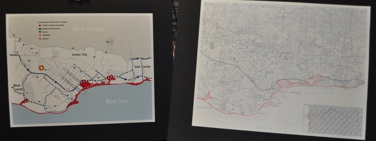
Jaenichen used research into cognitive behavioral science and her design skills to turn the topographical map on the right into the easy-read directional evacuation map on the left.
Since then the U.S. Geological Survey invited her to be part of the CA Tsunami Steering Committee and recently referred San Francisco to Jaenichen to discuss similar work for their waterfronts.
Even to the untrained eye, the new maps are a mighty improvement over what the understaffed municipal agencies were able to provide. They boast a limited color palette of blue, gray and a not-too-alarmist red and a streamlined design. But there’s a bundle of science behind the style, too.
Jaenichen and her design students collaborated with Steven Schandler, Ph.D., professor in the
Crean College of Health and Behavioral Sciences, and his students to test the new maps. She says she was motivated by her graduate work in the United Kingdom, where a greater emphasis is placed on “proving” a design.
“I knew I could fix it, but I had to discipline myself and understand what the issues are and then not only to say, ‘I know this looks good.’ But also to test and get data from it. And not test it just as something to be hung on a wall, but as something that will be used,” she says.
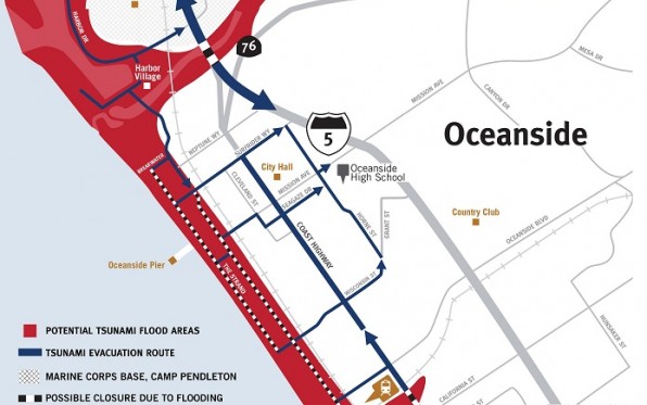
A portion of the map indicates which Oceanside roads are most likely to flood in the event of a tsunami.
So together with Schandler and his students they created an experiment assessing how the maps fared with real users. Much of that process involved Jaenichen and the students setting up tables on misty mornings along California beach fronts. There they asked some 400 participants to listen to verbal instructions, read topographical maps that included an overlay of flood zones or look at the redesigned map for two minutes.
The new maps passed the test. After 24 hours, participants who received evacuation instructions from the visual map consistently performed the best in recalling the directional information. The original topographical maps used by emergency management failed 100 percent within the first few weeks. Next, Jaenichen and Schandler would like to test the recall after seven days.
More research will add to her understanding of what works best, but Jaenichen is leaning toward the value of printed information seen regularly and in advance of its need – in public places and in scheduled mailings from the local cities or counties. Informational designers call it “information confrontation.” Otherwise, busy people aren’t inclined to think about evacuation routes. Then when it’s too late, many often fall into “stay put” mode. And that’s a recipe for compounding disaster. Not only are people endangering themselves but also the emergency responders who come to their assistance, she says.
“It’s a question of how do we get people to trust the information,” she says. “And first I think they need to have it.”
Sounds like a job for Wonder Woman after all.
